After our final submission we were given the task of evaluating one key aspect of our process and presenting it as part of an exhibition.
It is an easy choice for me, because I used so many layers for the background, but I strongly believe that layers are the most important aspect to creating an almost seamless montage.
Montage It! - Week 2
We brought in a draft flipbook (which I found the hardest part of this component) and brought our photo montages to be critiqued.
I traced over my montage and added detail on the inside to give a better idea of its scale. I also took note of the colours I needed to change to make it seem more natural, as well as removing some elements which didn't blend smoothly. The main goal for the take home task was to add atmosphere to the montages and have cleanly blended layers. To improve on my flipbook I chose a more accessible area and focused on detailed movement, rather than vague perceptions of the spaces.
Draw It! - Week 4
Final Presentation
The take home task for week 3 was to design a poster which encompassed all the aspects of drawing which we had learnt during Draw It! but also to communicate all aspects of our specific house. I focused on having a hierarchy in my drawings and a reason for where they were placed. The perspective drawing creates an immediate image of the building which is then able to be explored through the more detailed section and elevations. I placed the floor plans next to the corresponding floor in the perspective drawing, making it easier to picture the interior spaces when looking at the 3d image.
Draw It! - Week 3
For our take home task we were asked to draw elevations and section drawings of our specific house.
Section:
The key to the section drawing was a very thick line weight on walls which are cut through. This drawing is predominantly for structural understanding of the building.
Elevations:
The task was also to experiment with different styles of rendering that we had researched. I believe that "less is more" and chose simplistic rendering styles which I think worked effectively at creating a realistic image of the building, without distracting one from the detail of the facades.
Draw It! - Week 2
Rose Seidler Floor Plan:
Ground Floor
First Floor
In the studio we were introduced to the idea of perspective drawings. We went through the technical points of how to construct the drawing and then went outside to put this to practise. I started with just three buildings in pencil, then added pen to the main facades, and finally used the roof above to frame the buildings with a thick marker.
UNSW Perspective
Draw It! - Week 1
Studio:
We took a model from Model It! week 1 and sketched the floor plan, elevations and sections. The use of line weight was the key to communicating a 3d object with these drawings.
Floor Plan, Elevations and Section
We then sketched the model and added basic rendering techniques such as diagonal lines and using different weight pencils/pens.
This was good practice for the floor plans we were to draw for the take home task, I especially took note of the different weight pencils.
Model It! - Poster
Model It! Poster
The poster I created for the model-it component of the course shows my development throughout the four weeks. The materials I brought to the first studio were pretty unsuitable and untidy, and the cheap knife I used made very rough cuts. This obviously produced elementary models but I did learn from mistakes. I improved on the materials in the second week and used alternate methods of construction, but still made rough cuts until I purchase a good quality knife and a metal ruler. These helped me create an accurate site model in week 3 and I created a realistic landscape, which was somewhat distracting from the solid form building, but allowed me to take good photos from low angles. I am glad I made the mistakes I did over the three weeks leading up to the final model. It was complex and challenging but I felt sufficiently equipped and prepared, only lacking time in the end.
Model It! - Week 4
Fisher House
Scale 1:50
Construction
I started constructing the model similarly to the Barcelona Pavilion by drawing the floor plan onto the base, starting on the most detailed floor first after getting a good idea of how long this task would take from the studio in week 3. I added each wall after measuring it from the base, and seemed to save a lot of time doing this as well as making less mistakes.
For this task I was more prepared with the right materials and tools, and created the neatest and most accurate model I had yet. It was time consuming but satisfying to create a model which communicates realistic spaces so clearly. Taking photos from low angles into each space really helped understand the interior of the building without ever seeing it.
The complete Fisher House
Scale: 1:50
Montage It! - Week 3
We presented the finished montages in class, addressing the process we went through and the finishing touches we used to create atmosphere. The night time montage uses lighting effects to create atmosphere, whereas the day time montage has mist from the waterfall added for realism.
Daytime:
The flip book demonstrates the space on the second level of the building as you move up the entrance ramp and through the main structure.
As open and transparent as the building is, the cylindrical beams holding up the main feature distract your view from outside and draw you through the building as to provoke movement.
Nighttime:
Daytime:
The flip book demonstrates the space on the second level of the building as you move up the entrance ramp and through the main structure.
As open and transparent as the building is, the cylindrical beams holding up the main feature distract your view from outside and draw you through the building as to provoke movement.
Montage It! - Week 1
Create a model inspired by given criteria
Juan Gris: The Guitar (1918)
After some research on cubism and the themes of this painting, I wanted to integrate natural curves into a contrasting, rigid model. I first made the curved wire shapes and covered them with paper cladding, then tried to arrange them in a way which flowed. I sketched a few designs and eventually chose the one which portrayed the straight lines cutting through the apparent flow of the curves most obviously.
We were asked to photoshop our models into an appropriate context for the take home task. The curves in the model all seemed to fall downwards and appeared very natural. This reminded me of a waterfall so I found an appropriate image and integrated the model into the landscape. The scale of the building is such that large glass windows make the model more transparent, and therefore less intrusive in such a natural landscape.
Exterior:
Interior:
Model It! - Week 3
The take home task from week 2 was to create a 1:200 model of the Site Plan of the Fisher House.
The focus was not on the building itself, but on the landscape. It was a challenge to measure the contours and elevation of the site to scale but once I had the right thickness of balsa wood and a good surgical knife I could simply cut the contours and layer them on top of each other.
The best models were the ones with very simple blocks for the building and almost no colour. I used blue plastic and green spray paint for the river and trees respectively, which in hindsight is distracting from what the model is supposed to communicate.
In the studio we were given the elevations and floor plans of a small section of the Fisher house, scaled at 1:50.
I found this exercise extremely helpful because it made me realise how slow I was working. As a result I learnt quicker ways of building a detailed model; such as taking measurements off the model instead of referring to the elevations or floor plan every time. We had the option of using the seat detail for our take home task, however I figured I could have improved on my neatness and would have struggled to integrate it smoothly. Our take home task was to build the entire Fisher House at 1:50.
Seat Detail 1:50
Model It! - Week 2
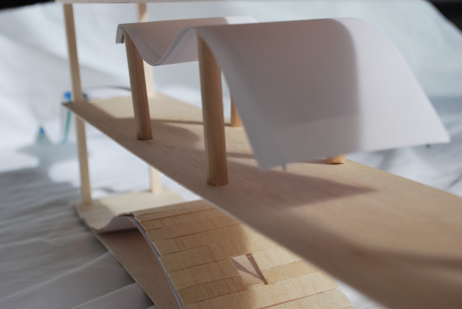
After discovering in the first week that boxboard was a very untidy material for models I purchased a few different thicknesses of balsa wood and drew out the floor plan on the base. Instead of using glue I cut slits along the lines which I had drawn and slotted each wall into the base. For the pool I simply stuck an image of water onto the floor plan and pushed an indent around the outside of it for a shadow effect. For the large glass windows I cut plastic to size and slotted it into the base similarly to the other walls. The two roofs had to be removable to allow us to see the spaces created by the building; I attached them to makeshift hinges made from sticky tape and balsa wood.
In the studio we were given another base shape to create models from (shown below)
My first thought was to have all the walls coming to a point, which made me learn to measure every cut very accurately if I wanted to create a neat model.
For my second model I was more focused on creating a functional building from the shape. I did find that I was limited for time so - as suggested - I started cutting shapes and arranging them in different ways. This worked well and my model eventually looked like a tiered grand stand.
We then collected all the models together and saw a huge variety of designs. We were then told to design our next model as differently as possible to our other two models, using inspiration from what we had seen from the rest of the class. The original shape seemed to have two unique triangles to it, so I made a collection of these and started positioning them to form an open space model, opposed to my solid forms I had been creating.
The most important knowledge I learnt from this studio is that models can communicate very elaborate concepts, even if the model itself is not complex.
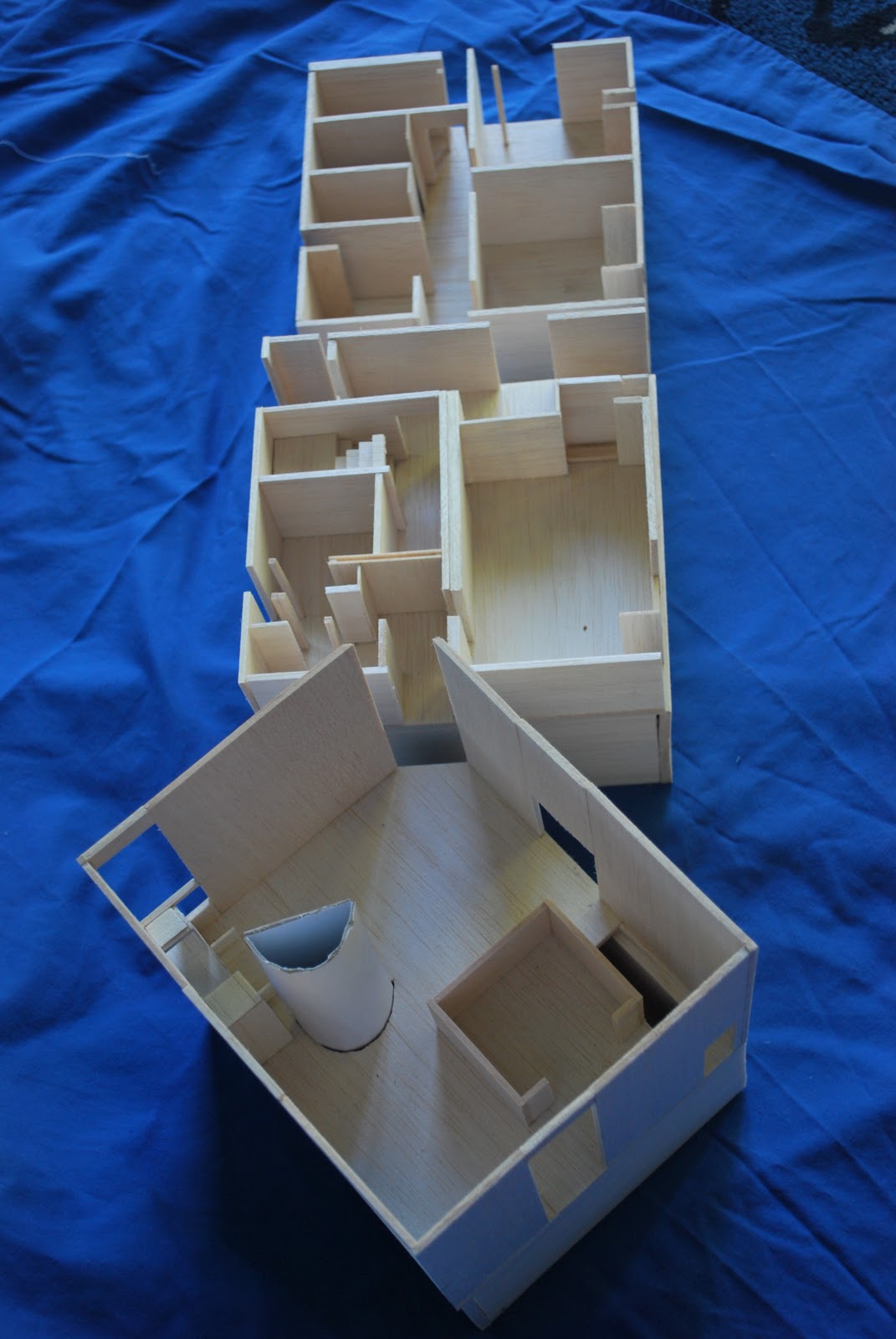
Subscribe to:
Posts (Atom)